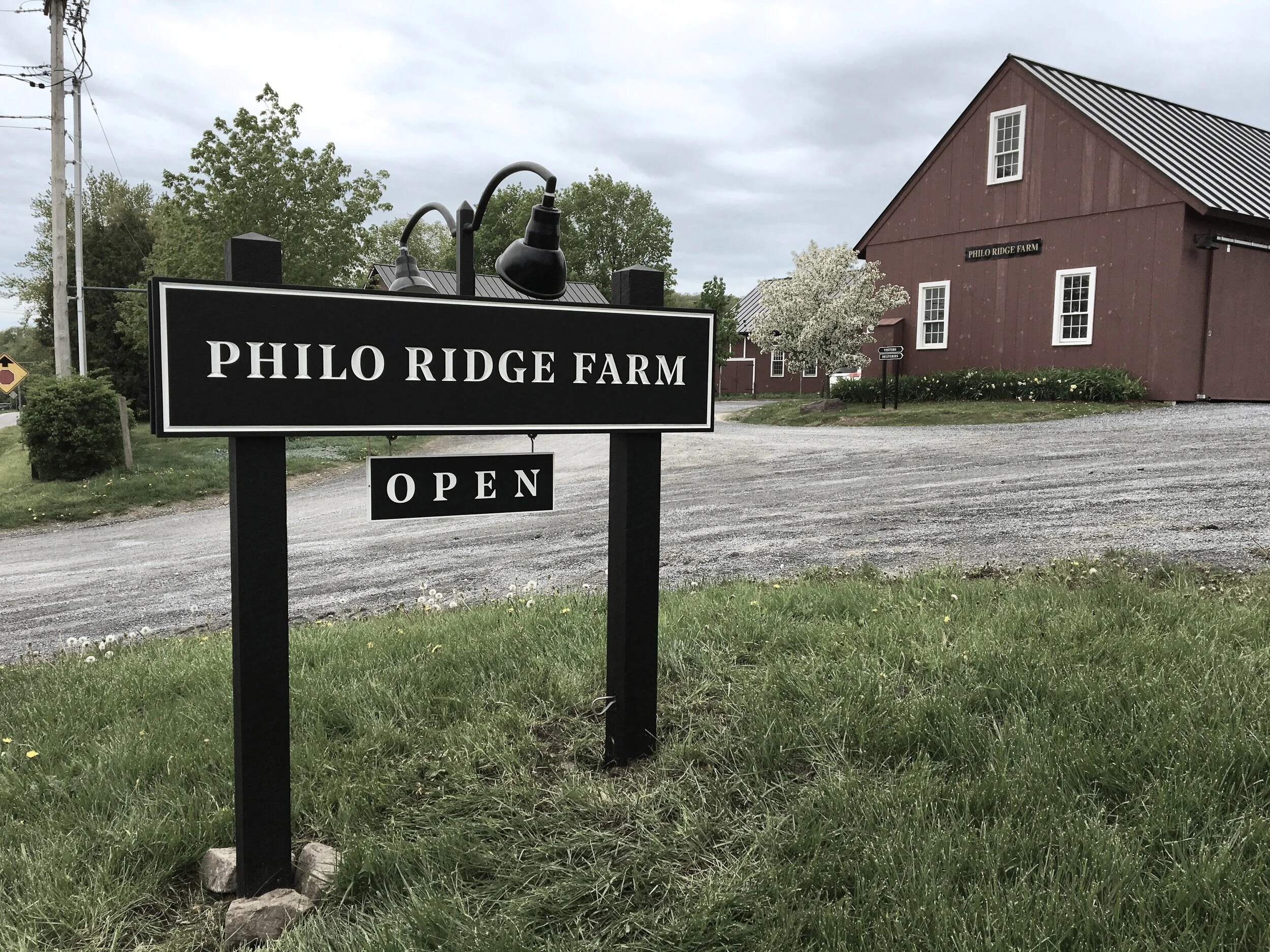
Philo Ridge Farm
Building a cornerstone in the community, with a unique and memorable identity.

BRAND IDENTITY, PACKAGING,
AND ENVIRONMENTAL DESIGN
Philo Ridge Farm approached Alexander Isley Inc. seeking a redesign for their farm and market’s new brand identity.
In contrast to their previous illustrated logo showcasing the farm’s iconic copper steeples, the farm was looking for a more modern, up-to-date design.
Modern, Historic, and TRADITIONAL…
The new identity was built to reflect the farm’s mission: regenerative agriculture, supporting farmers, the local economy, research, and education.
The brand helped provide a graphic direction, communicating key attributes such as resourcefulness, collaboration, passion, and joy. The goal was to target the local community, young and old farmers, educators and students, tourists, hikers, and bicyclists.


CATERING to the local community
The farm’s amazing market caters to its surrounding schools, neighbors, and visitors.
Inside are three food stations; a deli counter, a café, and a cheese counter, each with its own custom menu boards.
The menu boards are designed to easily be updated, working in tandem with the custom menu templates. This assures that the ever-changing menu can be printed on-site, at any time.
Differentiating the farm’s merchandise from outside retailers was very important, specialized stickers and hangtags were created utilizing the new brand vocabulary.


Encouraging their community and patrons to explore
Philo Ridge Farm needed a signage package that would encompass their market, trails, and multiple entryways.
It was important for the Farm to not disturb their neighbors with a boisterous road sign. With this in mind, we created a visual aesthetic for signage, in line with their new brand identity, keeping them concise and informative, without impeding on the farm’s beauty.


